Single purpose widgets are not customizable within the Console yet. You can follow our Developers documentation to edit the Look & Feel through our APIs. Here we introduce how to edit the Look & Feel of a Preference Center or a Multi purpose widget.
Headless widgets
Only Single and Multi purpose widgets can become Headless.
Headless widgets enable you to create fully customizable widgets in terms of both design and behavior. These widgets rely on the Didomi’s widgets engine, so they feature authentication management, analytics, content rendering, purpose and preference choices, and saving upon clicking or after user confirmation.
A set of elements like events and methods are available for generating the widget and collecting end-user consent and preference choices.
To understand how to build a Headless widget, please refer to our dedicated technical documentation.
Layout Shape
Customize widget shape
- Go to the Preference Management tab, in the left menu.
- Go to the widgets tab.
- Choose the widget you want to customize.
- Click on the pen icon on the same line as the widget you want to customize.
- Click on Look & Feel. The Look & Feel window is located on the right side of your screen.
- Go to the Layout Shape section.
- Select the shape between Smoothed, Rounded, and Squared.
-1.png?width=382&name=Card%20content%20(1)-1.png)
Theme
You have the possibility to select an existing theme to quickly add style to your widget, or to create a new one by yourself.
Select widget theme
- Go to the Preference Management tab, in the left menu.
- Go to the widgets tab.
- Choose the widget you want to edit.
- Click on the widget's name or on the pen icon, on the same row as the widget you want to edit.
- Click on Look & Feel. The Look & Feel window opens on the right side of your screen.
- Go to the section Layout Colors.
- Select the theme you want between Default, Abyss, Lagoon, Ocean and Sunset.

Custom widget theme
In the Preference Management Platform, you also have the possibility to customize the theme of your widget, to match your brand identity.
- Go to the Preference Management tab, in the left menu.
- Go to the widgets tab.
- Choose the widget you want to customize.
- Click on the widget's name or on the pen icon, on the same row as the widget you want to customize.
- Click on Look & Feel. The Look & Feel window is located on the right side of your screen.
- Go to the section Customized colors.
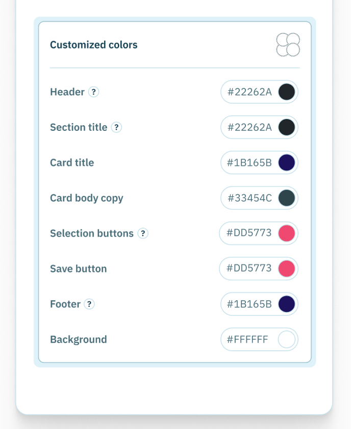
In this section, you can select the colors you want for your widget by yourself for these areas:
| Area | Impacted items |
|---|---|
| Header | Main title, description text |
| Section title | All the section titles between the cards |
| Card title | Card titles |
| Card body copy | Card body copy |
| Selection buttons | Radio buttons, checkboxes cards |
| Save button | Save button |
| Footer | Success icon, Thanks message |
| Background | Background of the widget |
The colors are in hexadecimal format, for example: #F56B2A.
To choose a color:
- Choose a section. For example: Section title.
- Click on the hexadecimal color code. A color picker opens.
- Play with the pipette or your cursor to find the color that matches your expectations. You can also directly enter the hexadecimal code.