The Preference Management Platform allows you to create widgets according to your needs. You can edit the content to match your visual identity, tone of voice and any languages you support.
Go to the widget content editing page
This page allows you to edit each element of your widget. On the left side, you can find your widget. Each element you modify is directly updated on your widget.
- Go to the Preference Management tab, on the left menu.
- Click on the WIDGETS tab.
- Select the widget you want to edit.
- Click on the pen icon, in the same row.
- Select Content Editor. The Content Editor window is displayed on the right.
From the Content Editor section, you can override your widget content and select the languages that your widget will be supporting.
Edit widget content
A widget is a collection of presentation components, potentially including a header, save button, and footer, as well as entities such as purposes and preferences, sourced from your Configuration Tree. You can edit the content of enabled components in every language of your widget.
- To display related fields in the right panel, select a component or entity in the widget preview and click on it.
- Edit the content
- Click on Save.
For a Single purpose widget, only one component is editable: the one corresponding to the entity selected when creating the widget, it will be either a purpose or a preference and this component will be displayed by default in the right panel.
See below for a detailed list of all editable content for each component included in the widget:
Set up widget languages
For any given widget, you can choose which languages will be displayed to your end-users.
You can define the default language of a widget and all languages that it will be supporting (check here the full list languages supported).
The widget will display a language based on the end-user's browser settings. If the end-user's browser language is not supported by the widget, the widget will display the default language.
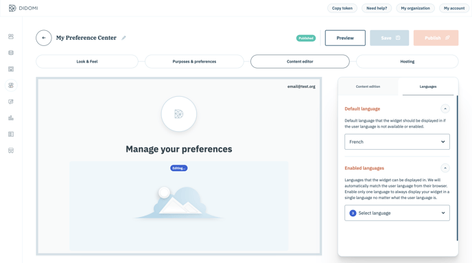
Define the default language for a widget
English is used as the default language when creating widgets. To edit the default widget default language:
- Go to the Languages tab
- Click on Default language select input
- Select the new default language
Edit the languages supported for a widget
- Go to the Languages tab
- Click on Enabled languages select input
- Select languages to be supported
Fix missing translations
Didomi provides translations for all static content by default. This includes purpose Yes and No values, widget title, Save button content, and Thank You message. To override this content, please refer to our dedicated documentation above.
For the entities created in your Configuration Tree, you need to add translations for every language that your widget will support. Translations for purposes can be managed from the Data Manager, while preferences translations can be edited through the API.
If any translations are missing for these entities, an alert will be displayed in the Didomi Console and missing translations will be represented by a series of dots in the widget preview.
This alert will allow you to access an overview of all missing translations by clicking on the eye icon button, or to display each missing translation individually by clicking on the arrow buttons. From there, you can fill in the empty fields using the language enabled within your widget.
Note that when you fix a missing translation in the widget, you will add the translation for that entity only at the widget level. The root content language in your Data Manager or Preferences Library will not be updated.
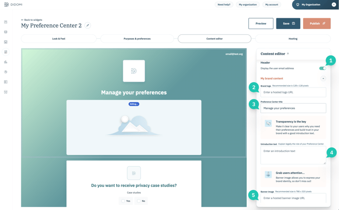
Header
The content editor allows you to manage all editorial and branding content for your widget:
- The user email address (1): choose to display (or not) for the user.
My brand content:
- The brand logo (2): add an image for your brand logo, at least 128x128px.
- Preference Center's title (3): by default this is "Manage your preferences". This field cannot be empty.
- Preference Center Introductory text (4)
- Preference Center banner image (5): recommended size at least 780x320px.
Purpose
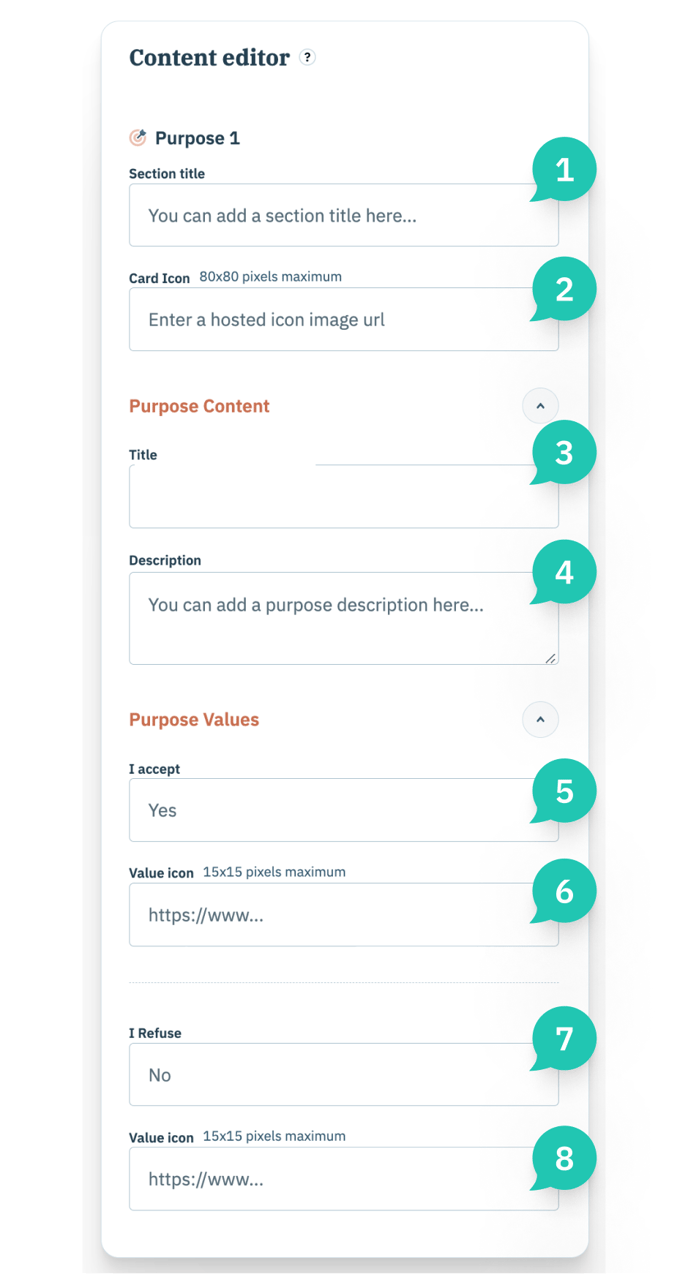
The purpose panel allows you to manage the content of your purpose. From this panel, you can edit the following sections:
Purpose Content
- Title (3): you can edit the default title of your purpose created in your Data Manager.
- Description (4): you can edit the default description of your purpose created in your Data Manager.
Purpose Values
- Yes (5): you can edit the positive value of your purpose. ("Yes" is the default value)
- Value icon (6): recommended dimensions: 15x15 pixels.
- No (6): you can edit the negative value of your purpose. (“No” is the default value)
- Value icon (8): recommended dimensions: 15x15 pixels.
Preferences
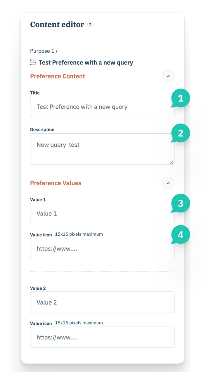
The preferences panel allows you to edit the content of your preference(s). From this panel, you can edit the following sections:
Preference content
- Title (1): you can edit the default title of your preference created in your Preferences Library.
- Description (2): you can edit the default description of your preference created in your Preferences Library.
Preference value
- Preference Value(s) (3): you can edit the values of your preference created in your Preferences Library.
- Value icon (4): recommended dimensions: 15x15 pixels.
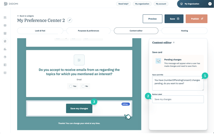
Save card
The save card panel allows you to manage the save part of your widget. From this panel, you can modify:
- Save card messages: the default message (1) and the message displayed when the user applies any change. You can add the {numberOfPendingConsent} variable which allows you to know the number of changes made by the user. You can leave this field empty if needed.
- Save card button text (2 & 3): the default text is "Save your changes". This field cannot be empty.
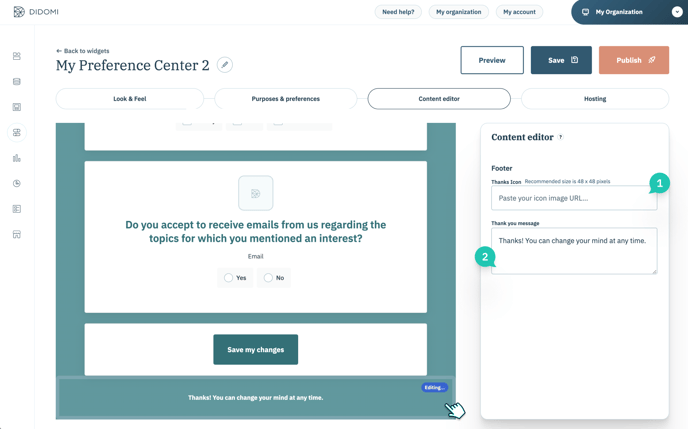
Footer
The footer panel allows you to manage the footer of your widget. From this panel, you can modify:
- The default "thank you" message (1): this field is pre-filled by default. You can leave it empty.
- The Thank you icon (2): recommended dimensions: 15x15px
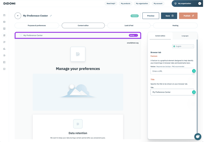
Favicon & Title
For Preference Centers, the content editor allows you to manage the title and favicon that are displayed on the browser tab.
- Favicon (1): recommended dimensions: at least 16x16 pixels
- Title (2): The title can be translated into every language selected for a widget. If the field is left empty, the URL will be displayed.